
sliver_tools
v0.2.12A set of useful sliver tools that are missing from the flutter framework
Package archive: https://pubdev.letsnova.ru/api/archives/sliver_tools/0.2.12.tar.gz
dart pub add sliver_toolsReadme
sliver_tools

A set of useful sliver tools that are missing from the flutter framework.
Here is a taste what you can make using this package
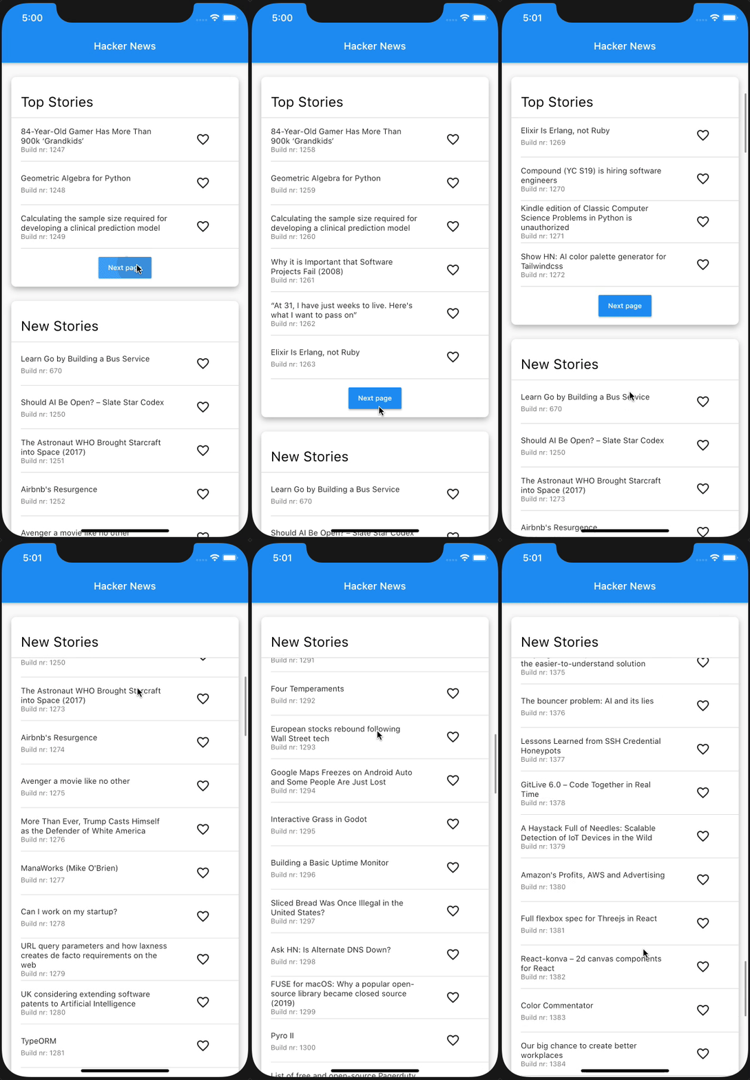
The structure of this app:
class Section extends State {
                  @override
                  Widget build(BuildContext context) {
                    return MultiSliver(
                      pushPinnedChildren: true,
                      children: <Widget>[
                        SliverPersistentHeader(
                          pinned: true,
                          ...
                        ),
                        if (!infinite)
                          SliverAnimatedPaintExtent(
                            child: SliverList(...),
                          )
                        else
                          SliverList(...),
                      ],
                    );
                  }
                }

                class NewsPage extends StatelessWidget {
                  @override
                  Widget build(BuildContext context) {
                    return CustomScrollView(
                      slivers: <Widget>[
                        Section(infinite: false),
                        Section(infinite: true),
                      ],
                    );
                  }
                }
MultiSliver
The MultiSliver widget allows for grouping of multiple slivers together such that they can be returned as a single widget. For instance when one wants to wrap a few slivers with some padding or an inherited widget.
Example
class WidgetThatReturnsASliver extends StatelessWidget {
                  @override
                  Widget build(BuildContext context) {
                    return MultiSliver(
                      pushPinnedChildren: false, // defaults to false
                      children: <Widget>[
                        SliverPersistentHeader(...),
                        SliverList(...),
                      ],
                    );
                  }
                }
The pushPinnedChildren parameter allows for achieving a 'sticky header' effect by simply using pinned SliverPersistentHeader widgets (or any custom sliver that paints beyond its layoutExtent).
SliverStack
The SliverStack widget allows for stacking of both slivers and box widgets. This can be useful for adding some decoration to a sliver. Which is what some of the other widgets in this package use to get their desired effects.
Example
class WidgetThatReturnsASliver extends StatelessWidget {
                  @override
                  Widget build(BuildContext context) {
                    return SliverStack(
                      insetOnOverlap: false, // defaults to false
                      children: <Widget>[
                        SliverPositioned.fill(
                          child: Container(
                            decoration: BoxDecoration(
                              color: Colors.white,
                              boxShadow: const <BoxShadow>[
                                BoxShadow(
                                  offset: Offset(0, 4),
                                  blurRadius: 8,
                                  color: Colors.black26,
                                )
                              ],
                              borderRadius: BorderRadius.circular(8),
                            ),
                          ),
                        ),
                        SliverList(...),
                      ],
                    );
                  }
                }
The insetOnOverlap handles whether the positioned children should be inset (made smaller) when the sliver has overlap from a previous sliver.
SliverClip
The SliverClip widget will add a clip around its child from the child's paintOrigin to its paintExtent. This is very useful and most likely what you want when using a pinned SliverPersistentHeader as child of the stack.
Example
class WidgetThatReturnsASliver extends StatelessWidget {
                  @override
                  Widget build(BuildContext context) {
                    return SliverClip(
                      clipOverlap: true, // defaults to true
                      child: SliverList(...),
                    );
                  }
                }
The clipOverlap parameter allows for configuring whether any overlap with the previous child should be clipped.
This can be useful when one has a SliverPersitentHeader above a SliverList and does not want to give the header an opaque background but also prevent the list from drawing underneath the header.
SliverAnimatedPaintExtent
The SliverAnimatedPaintExtent widget allows for having a smooth transition when a sliver changes the space it will occupy inside the viewport. For instance when using a SliverList with a button below it that loads the next few items.
Example
class WidgetThatReturnsASliver extends StatelessWidget {
                  @override
                  Widget build(BuildContext context) {
                    return SliverAnimatedPaintExtent(
                      duration: const Duration(milliseconds: 150),
                      child: SliverList(...),
                    );
                  }
                }
SliverAnimatedSwitcher
The SliverAnimatedSwitcher widget is simply a pre-configured AnimatedSwitcher widget.
If one needs more options than supplied by this widget a regular AnimatedSwitcher can be used by giving it the defaultLayoutBuilder and defaultTransitionBuilder of SliverAnimatedSwitcher.
SliverCrossAxisConstrained
The SliverCrossAxisConstrained widget allows for limiting the cross axis extent of a sliver to a maximum value given by the maxCrossAxisExtent.
For instance a long list of text items on an iPad would be too wide to read so one can wrap the SliverList in a SliverCrossAxisConstrained and limit its width to something more reasonable.
Example
class WidgetThatReturnsASliver extends StatelessWidget {
                  @override
                  Widget build(BuildContext context) {
                    return SliverCrossAxisConstrained(
                      maxCrossAxisExtent: 700,
                      alignment: 0, // between -1.0 (left) and 1.0 (right)
                      child: SliverList(...),
                    );
                  }
                }
SliverCrossAxisPadded
The SliverCrossAxisPadded widget allows for adding padding to the cross axis of a sliver.
This can be done either by passing a paddingStart and/or paddingEnd or by using the symmetric constructor which takes a single padding value.
When using paddingStart and paddingEnd in a vertical sliver it will depend on the TextDirection whether start is left or right.
Example
class WidgetThatReturnsASliver extends StatelessWidget {
                  @override
                  Widget build(BuildContext context) {
                    return SliverCrossAxisPadded(
                      paddingStart: 24,
                      paddingEnd: 48,
                      textDirection: TextDirection.ltr, // optional, defaults to the Directionality specified by the context
                      child: SliverList(...),
                    );
                  }
                }
SliverPinnedHeader
The SliverPinnedHeader widget allows for easily making a pinned header. It will size itself to the size of the child and when it reaches the leading edge of the viewport stay there instead of scrolling off the screen.
Buy me a coffee ☕️

Changelog
0.2.12
Revert SliverStack and MultiSliver back to have non const constructors for backwards compatibility
0.2.11
- Added
reverseDuration,switchInCurveandswitchOutCurveto SliverAnimatedSwitcher - Fixed compatibility with flutter 3.13 and onward
0.2.10
Fixed issue with hit testing of SliverCrossAxisConstrained.
0.2.9
- Fixed #70 by using a specific hit test method with thanks to @knopp
- Fixed an edge case where
SliverClipRectcould have a null dereference with thanks to @siqwin
0.2.8
- Fixed #56 by accounting for maxScrollObstructionExtent with thanks to @manu-sncf
- Added some asserts to validate layout of children
0.2.7
Fixed issue when using a center key in the CustomScrollView when using MultiSliver.
0.2.6
Added alignment property to SliverCrossAxisConstrained.
0.2.5
Fixed issue where the maxPaintExtent was not calculated correctly in some rare cases.
0.2.4
Fixed formatting for pub analysis.
0.2.3
Fixed dev_dependency for pub analysis.
0.2.2
Fixed issue where small content of a MultiSliver would cause an exception when
the overlap it got was larger.
0.2.1
This version essentially makes the SliverToBoxAdapter widget obsolete.
MultiSliver now accepts RenderBox children directly!🎉
- Accept box children of MultiSliver.
- Fixed floating point rounding error that happens in debug mode.
0.2.0
BREAKING:
- Migrated to nullsafety
- All render objects are now part of the private api. If you want to depend on them as public API, please open an issue.
0.1.10
Further improved childScrollOffset of MultiSliver.
MultiSliver now correctly passes the incoming precedingScrollExtent to the children.
0.1.9
Fixed edge cases for applyPaintTransform and childScrollOffset of MultiSliver.
0.1.8
Improved hit testing of positioned children in SliverStack.
0.1.7
Fixed issue where hit testing of positioned children in SliverStack failed.
0.1.6
Fixed issue where hit testing of a pinned SliverPinnedHeader failed.
0.1.5
Added SliverPinnedHeader
0.1.4+1
Fixes small layoutExtent issue in MultiSliver
0.1.4
Added SliverCrossAxisPadded
0.1.3
Added SliverCrossAxisConstrained with thanks to @remonh87
0.1.2+3
- Improved handling of reverse scroll direction
- Added
insetOnOverlapparameter to SliverStack
0.1.2+2
Fixed a small analysis issue
0.1.2
Added the following widgets:
0.1.1
Updated readme and changelog links
0.1.0
Initial release including: