
percent_indicator
v4.2.5Library that allows you to display progress widgets based on percentage, can be Circular or Linear, you can also customize it to your needs.
Package archive: https://pubdev.letsnova.ru/api/archives/percent_indicator/4.2.5.tar.gz
dart pub add percent_indicatorReadme
Percent Indicator

Circular, Linear and Multi-segment linear percent indicators


Features
- Circle percent indicator
- Linear percent indicator
- Multi-segment linear indicator
- Toggle animation
- Custom duration of the animation
- Progress based on a percentage value
- Progress and background color
- Custom size
- Left , right or center child for Linear percent indicator
- Top, bottom or center child for Circular percent indicator
- Progress Color using gradients
Getting started
You should ensure that you add the router as a dependency in your flutter project.
dependencies:
                  percent_indicator: ^4.2.5
You should then run flutter packages upgrade or update your packages in IntelliJ.
Example Project
There is a example project in the example folder. Check it out. Otherwise, keep reading to get up and running.
Usage
Need to include the import the package to the dart file where it will be used, use the below command,
import 'package:percent_indicator/percent_indicator.dart';
Circular percent indicator
Basic Widget
new CircularPercentIndicator(
                                  radius: 60.0,
                                  lineWidth: 5.0,
                                  percent: 1.0,
                                  center: new Text("100%"),
                                  progressColor: Colors.green,
                                )
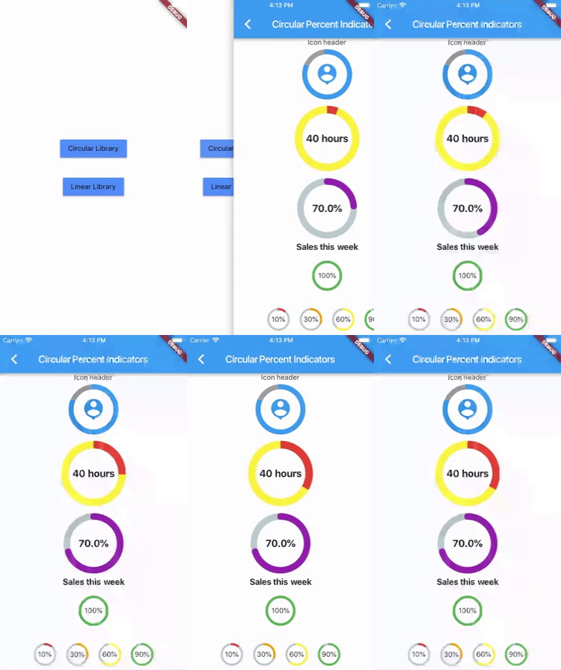
Complete example
  @override
                  Widget build(BuildContext context) {
                    return Scaffold(
                      appBar: new AppBar(
                        title: new Text("Circular Percent Indicators"),
                      ),
                          body: Center(
                        child: ListView(
                            children: <Widget>[
                              new CircularPercentIndicator(
                                radius: 100.0,
                                lineWidth: 10.0,
                                percent: 0.8,
                                header: new Text("Icon header"),
                                center: new Icon(
                                  Icons.person_pin,
                                  size: 50.0,
                                  color: Colors.blue,
                                ),
                                backgroundColor: Colors.grey,
                                progressColor: Colors.blue,
                              ),
                              new CircularPercentIndicator(
                                radius: 130.0,
                                animation: true,
                                animationDuration: 1200,
                                lineWidth: 15.0,
                                percent: 0.4,
                                center: new Text(
                                  "40 hours",
                                  style:
                                      new TextStyle(fontWeight: FontWeight.bold, fontSize: 20.0),
                                ),
                                circularStrokeCap: CircularStrokeCap.butt,
                                backgroundColor: Colors.yellow,
                                progressColor: Colors.red,
                              ),
                              new CircularPercentIndicator(
                                radius: 120.0,
                                lineWidth: 13.0,
                                animation: true,
                                percent: 0.7,
                                center: new Text(
                                  "70.0%",
                                  style:
                                      new TextStyle(fontWeight: FontWeight.bold, fontSize: 20.0),
                                ),
                                footer: new Text(
                                  "Sales this week",
                                  style:
                                      new TextStyle(fontWeight: FontWeight.bold, fontSize: 17.0),
                                ),
                                circularStrokeCap: CircularStrokeCap.round,
                                progressColor: Colors.purple,
                              ),
                              Padding(
                                padding: EdgeInsets.all(15.0),
                                child: new CircularPercentIndicator(
                                  radius: 60.0,
                                  lineWidth: 5.0,
                                  percent: 1.0,
                                  center: new Text("100%"),
                                  progressColor: Colors.green,
                                ),
                              ),
                              Container(
                                padding: EdgeInsets.all(15.0),
                                child: new Row(
                                  mainAxisAlignment: MainAxisAlignment.center,
                                  children: <Widget>[
                                    new CircularPercentIndicator(
                                      radius: 45.0,
                                      lineWidth: 4.0,
                                      percent: 0.10,
                                      center: new Text("10%"),
                                      progressColor: Colors.red,
                                    ),
                                    new Padding(
                                      padding: EdgeInsets.symmetric(horizontal: 10.0),
                                    ),
                                    new CircularPercentIndicator(
                                      radius: 45.0,
                                      lineWidth: 4.0,
                                      percent: 0.30,
                                      center: new Text("30%"),
                                      progressColor: Colors.orange,
                                    ),
                                    new Padding(
                                      padding: EdgeInsets.symmetric(horizontal: 10.0),
                                    ),
                                    new CircularPercentIndicator(
                                      radius: 45.0,
                                      lineWidth: 4.0,
                                      percent: 0.60,
                                      center: new Text("60%"),
                                      progressColor: Colors.yellow,
                                    ),
                                    new Padding(
                                      padding: EdgeInsets.symmetric(horizontal: 10.0),
                                    ),
                                    new CircularPercentIndicator(
                                      radius: 45.0,
                                      lineWidth: 4.0,
                                      percent: 0.90,
                                      center: new Text("90%"),
                                      progressColor: Colors.green,
                                    )
                                  ],
                                ),
                              )
                            ]),
                      ),
                    );
                  }
Linear percent indicator
Basic Widget
new LinearPercentIndicator(
                                width: 140.0,
                                lineHeight: 14.0,
                                percent: 0.5,
                                backgroundColor: Colors.grey,
                                progressColor: Colors.blue,
                              ),
Complete example
@override
                  Widget build(BuildContext context) {
                    return Scaffold(
                      appBar: new AppBar(
                        title: new Text("Linear Percent Indicators"),
                      ),
                      body: Center(
                        child: Column(
                          mainAxisAlignment: MainAxisAlignment.center,
                          children: <Widget>[
                            Padding(
                              padding: EdgeInsets.all(15.0),
                              child: new LinearPercentIndicator(
                                width: 140.0,
                                lineHeight: 14.0,
                                percent: 0.5,
                                center: Text(
                                  "50.0%",
                                  style: new TextStyle(fontSize: 12.0),
                                ),
                                trailing: Icon(Icons.mood),
                                linearStrokeCap: LinearStrokeCap.roundAll,
                                backgroundColor: Colors.grey,
                                progressColor: Colors.blue,
                              ),
                            ),
                            Padding(
                              padding: EdgeInsets.all(15.0),
                              child: new LinearPercentIndicator(
                                width: 170.0,
                                animation: true,
                                animationDuration: 1000,
                                lineHeight: 20.0,
                                leading: new Text("left content"),
                                trailing: new Text("right content"),
                                percent: 0.2,
                                center: Text("20.0%"),
                                linearStrokeCap: LinearStrokeCap.butt,
                                progressColor: Colors.red,
                              ),
                            ),
                            Padding(
                              padding: EdgeInsets.all(15.0),
                              child: new LinearPercentIndicator(
                                width: MediaQuery.of(context).size.width - 50,
                                animation: true,
                                lineHeight: 20.0,
                                animationDuration: 2000,
                                percent: 0.9,
                                center: Text("90.0%"),
                                linearStrokeCap: LinearStrokeCap.roundAll,
                                progressColor: Colors.greenAccent,
                              ),
                            ),
                            Padding(
                              padding: EdgeInsets.all(15.0),
                              child: new LinearPercentIndicator(
                                width: MediaQuery.of(context).size.width - 50,
                                animation: true,
                                lineHeight: 20.0,
                                animationDuration: 2500,
                                percent: 0.8,
                                center: Text("80.0%"),
                                linearStrokeCap: LinearStrokeCap.roundAll,
                                progressColor: Colors.green,
                              ),
                            ),
                            Padding(
                              padding: EdgeInsets.all(15.0),
                              child: Column(
                                children: <Widget>[
                                  new LinearPercentIndicator(
                                    width: 100.0,
                                    lineHeight: 8.0,
                                    percent: 0.2,
                                    progressColor: Colors.red,
                                  ),
                                  new LinearPercentIndicator(
                                    width: 100.0,
                                    lineHeight: 8.0,
                                    percent: 0.5,
                                    progressColor: Colors.orange,
                                  ),
                                  new LinearPercentIndicator(
                                    width: 100.0,
                                    lineHeight: 8.0,
                                    percent: 0.9,
                                    progressColor: Colors.blue,
                                  )
                                ],
                              ),
                            ),
                          ],
                        ),
                      ),
                    );
                  }
Multi-segment linear indicator
Basic Widget
new MultiSegmentLinearIndicator(
                                width: MediaQuery.of(context).size.width - 64,
                                lineHeight: 30.0,
                                firstSegmentPercent: 0.25,
                                secondSegmentPercent: 0.4,
                                thirdSegmentPercent: 0.35,
                                firstSegmentColor: Color(0xFF4285F4),
                                secondSegmentColor: Color(0xFF6DD5F6),
                                thirdSegmentColor: Color(0xFFEFEFEF),
                                enableStripes: [1],
                                barRadius: Radius.circular(10.0),
                                animation: true,
                                animationDuration: 1000,
                                curve: Curves.easeInOut,
                                animateFromLastPercent: true,
                                onAnimationEnd: () {
                                  ScaffoldMessenger.of(context).showSnackBar(
                                    const SnackBar(
                                      content: Text('Animation completed!'),
                                      duration: Duration(seconds: 1),
                                    ),
                                  );
                                },
                              ),
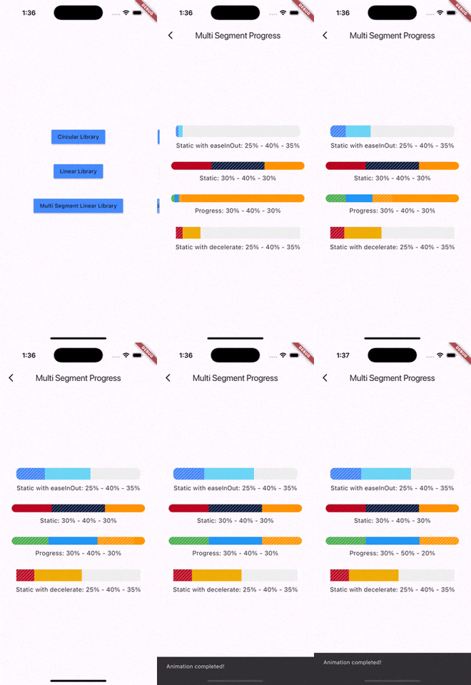
Complete example
@override
                  Widget build(BuildContext context) {
                    return Scaffold(
                      appBar: AppBar(
                        title: Text('Multi Segment Progress'),
                      ),
                      body: Center(
                        child: Padding(
                          padding: const EdgeInsets.all(20.0),
                          child: Column(
                            mainAxisAlignment: MainAxisAlignment.center,
                            children: [
                              MultiSegmentLinearIndicator(
                                width: MediaQuery.of(context).size.width - 64,
                                lineHeight: 30.0,
                                firstSegmentPercent: 0.25,
                                secondSegmentPercent: 0.4,
                                thirdSegmentPercent: 0.35,
                                firstSegmentColor: Color(0xFF4285F4),
                                secondSegmentColor: Color(0xFF6DD5F6),
                                thirdSegmentColor: Color(0xFFEFEFEF),
                                enableStripes: [1],
                                barRadius: Radius.circular(10.0),
                                animation: true,
                                animationDuration: 1000,
                                curve: Curves.easeInOut,
                                animateFromLastPercent: true,
                                onAnimationEnd: () {
                                  ScaffoldMessenger.of(context).showSnackBar(
                                    const SnackBar(
                                      content: Text('Animation completed!'),
                                      duration: Duration(seconds: 1),
                                    ),
                                  );
                                },
                              ),
                              SizedBox(height: 10),
                              Text(
                                'Static with easeInOut: 25% - 40% - 35%',
                                style: TextStyle(fontSize: 16),
                              ),
                              SizedBox(height: 30),
                              MultiSegmentLinearIndicator(
                                width: MediaQuery.of(context).size.width - 40,
                                lineHeight: 20.0,
                                firstSegmentPercent: 0.3,
                                secondSegmentPercent: 0.4,
                                thirdSegmentPercent: 0.3,
                                firstSegmentColor: Color(0xFFBA0521),
                                secondSegmentColor: Color(0xFF071437),
                                thirdSegmentColor: Color(0xFFFF9205),
                                enableStripes: [2],
                                barRadius: Radius.circular(20),
                              ),
                              SizedBox(height: 10),
                              Text(
                                'Static: 30% - 40% - 30%',
                                style: TextStyle(fontSize: 16),
                              ),
                              SizedBox(height: 30),
                              MultiSegmentLinearIndicator(
                                width: MediaQuery.of(context).size.width - 40,
                                lineHeight: 20.0,
                                firstSegmentPercent: firstSegment,
                                secondSegmentPercent: secondSegment,
                                thirdSegmentPercent: thirdSegment,
                                firstSegmentColor: Colors.green,
                                secondSegmentColor: Colors.blue,
                                thirdSegmentColor: Colors.orange,
                                enableStripes: [1, 3],
                                animation: true,
                                animateFromLastPercent: true,
                                animationDuration: 1000,
                                curve: Curves.easeInOut,
                                barRadius: Radius.circular(10),
                              ),
                              SizedBox(height: 10),
                              Text(
                                'Progress: ${(firstSegment * 100).toInt()}% - ${(secondSegment * 100).toInt()}% - ${(thirdSegment * 100).toInt()}%',
                                style: TextStyle(fontSize: 16),
                              ),
                              SizedBox(height: 30),
                              MultiSegmentLinearIndicator(
                                width: MediaQuery.of(context).size.width - 64,
                                lineHeight: 30.0,
                                firstSegmentPercent: 0.15,
                                secondSegmentPercent: 0.4,
                                thirdSegmentPercent: 0.45,
                                firstSegmentColor: Color(0xFFBA0521),
                                secondSegmentColor: Color(0xFFAEFAB00),
                                thirdSegmentColor: Color(0xFFEFEFEF),
                                enableStripes: [1],
                                animation: true,
                                animationDuration: 1000,
                                curve: Curves.decelerate,
                                animateFromLastPercent: true,
                              ),
                              SizedBox(height: 10),
                              Text(
                                'Static with decelerate: 25% - 40% - 35%',
                                style: TextStyle(fontSize: 16),
                              ),
                              SizedBox(height: 30),
                            ],
                          ),
                        ),
                      ),
                    );
                  }
You can follow me on twitter @diegoveloper
Changelog
[4.2.5]
- Added clipRotatedLinearGradient param, thanks kamil-matula
- Enabling multi-segment progress bar with animations and stripes, thanks naseerahmedaziz
- A lot of fixes.
[4.2.4]
- A lot of fixes.
[4.2.3]
- Screenshots added. Thanks FMorschel.
[4.2.2]
- This version is for flutter 3.0 >=.
[4.2.1]
- Add compatibility with lower versions of flutter.
[4.2.0]
- Flutter 3.0 updated.
[4.0.1]
- Fixed a bug: 1% progress should be inside. Thanks Gábor.
[4.0.0]
- [BREAKING CHANGE] now
radiusis a real radius and not diameter. Thanks toNipun Shah.
[3.5.0]
linearStrokeCapwas deprecated. UsebarRadiusinstead. Thanks tomartinkong0806.
[3.4.0]
- Null safety migration completed.
- Widget Indicator works when using Arc mode on
CircularPercentIndicator.
[3.0.1]
linearGradientBackgroundColorwas added forLinearPercentIndicator. Thanks Jeremiah Parrack.
[3.3.0-nullsafety.1 - 3.0.0]
- Null safety migration.
2.1.9 - 2.1.9+1
- Users can stop
animationafter this was initialize. - Added Half Arc for
CircularPercentIndicator, added by Vivek - Extra height was removed. Thanks Brayan Cantos.
2.1.8
- New field was added :
rotateLinearGradient-> Enable rotation of linear gradient in circular percent indicator. Added byecokeco.
2.1.7 - 2.1.7+4
- Added optional
widgetIndicatorforCircularPercentIndicatorandLinearPercentIndicator, it's an indicator displayed at the end of the progress, it only works when theanimationistrue. Thanks to Brayan Cantos for the contribution
2.1.6
- Added optional
onAnimationEndforCircularPercentIndicatorandLinearPercentIndicator, it's a callback when the animation ends. Thanks to Brayan Cantos for the contribution
2.1.5
- Added optional
backgroundWidthforCircularPercentIndicator. Thanks to CircuitGuy for the contribution
2.1.4
restartAnimationwas added to restart the animation when reached the end. Thanks to superciccio for the contribution
2.1.3
- Added
StrokeCapon background. Thanks @mifama
2.1.2
curvewas added in both indicators.
2.1.1
LinearPercentIndicatornow can display only part of linear gradient usingclipLinearGradient.
2.1.0
- vertical padding removed from
LinearPercentIndicator.
2.0.1
maskFilterwas added forLinearPercentIndicatorandCircularPercentIndicator. Thanks to akdu12 for the contribution
2.0.0
linearGradientwas added forLinearPercentIndicatorandCircularPercentIndicator.reverse,arcTypeandarcBackgroundColorwere added to theCircularPercentIndicator.
1.0.16
widthis optional forLinearPercentIndicatorwidget,
1.0.15
- Added
addAutomaticKeepAliveproperty to preserve the state of the widget. - Added
isRTLforLinearPercentIndicatorwidget.
1.0.14
- Fixed bug using animateFromLastPercent. Thanks joelbrostrom
1.0.13
- Padding removed from leading and trailing on LinearPercentIndicator, now you can use Expanded or Flexible.
- Fixed animation when refresh the widget with different duration
1.0.12
- animateFromLastPercent property was added for LinearPercentIndicator and CircularPercentIndicator
1.0.11
- startAngle for CircularPercentIndicator was added
1.0.10
- animation update bug fixed. Thanks @Tiagosito
1.0.9
- padding property was added for LinearPercentIndicator
1.0.7, 1.0.8
- alignment property was added for LinearPercentIndicator
1.0.5, 1.0.6
- fillColor property was added to LinearPercentIndicator
1.0.1 - 1.0.4
- Readme updated
1.0.0
Initial release of the multi_segment_linear_indicator package.
Features
- Three independently animated segments
- Customizable colors for each segment
- Optional striped pattern for the middle segment
- Smooth animations with customizable duration and curve
- Configurable border radius
- RTL support
- Flexible sizing and padding options
Documentation
- Added comprehensive README with usage examples
- Added API documentation
- Added example application